An experiment to expand possibilities.
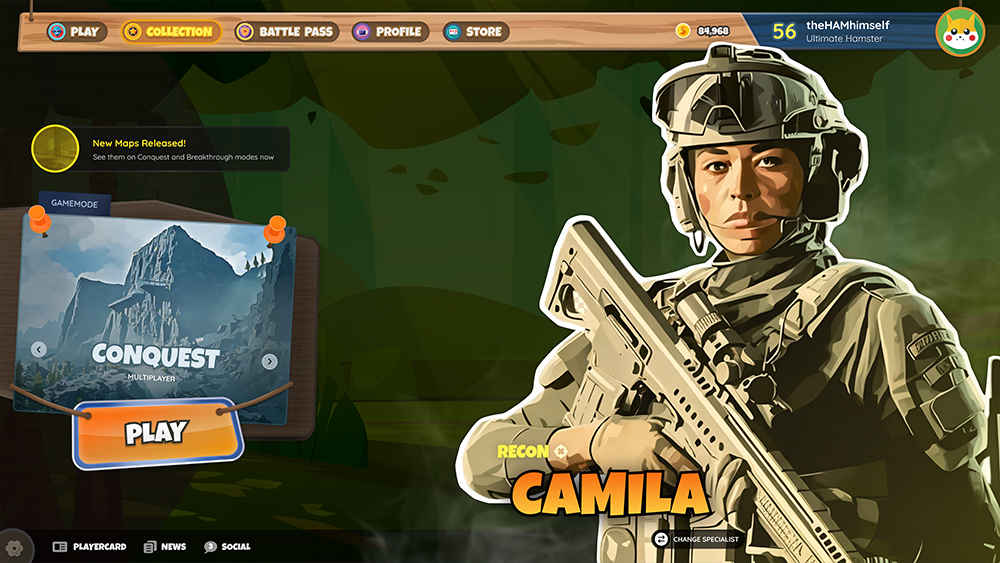
As part of an exploration in UI applications and theming, I took an opportunity to craft something that would likely never happen: morphing the visual tone of a serious game to a whimsical one. Battlefield 2042, set deep in an era of conflict and war, naturally takes a serious, technologically-advanced visual tone. I thought it would be an interesting challenge to convert the style of the UI to that of a Crash Bandicoot-esque one – because why not?
The result was genre-bending interface that brings an entirely different vibe to an otherwise serious environment.
See the process below, or skip to the full concept here.
View Full Concept
Project Intention
Explore and emulate
The goal of the exploration was to interpret what was already presented by the Battlefield UI, digest why things were where they are and what they looked like, and re-skin them in a style akin to Crash Bandicoot: bold, erratic, comical, and cartoon-like.
Skills & Tools
- UI
- Figma
- Photoshop
Keep It Simple
Usability remained absolutely critical, but for the most part, I retained what the BF2042 team implemented in terms of structure and options – this experiment was much more about the visual presentation.
Define A Vibe
The exploration demanded that an updated vibe be defined – enter: a cartoonified warzone that still retained definition, detail, and professionalism.
Clean And Clear
With the implementation of this vibe, a decision needed to be made as to how far (or how close) to take the deviation. What resulted is a happy blend of bold, comical, tangible elements, with clean lines, simple textures, and a readable interface.
War without hostility
The flavor profile of this UI style is intended to bring a sense of fun that lifts the heavier atmosphere portrayed naturally by the current BF2042 interface.Vibrant colors, thick borders, and bold text transform the existing style into a more lighthearted one, without losing utility.


A lighter title screen
The options were kept mostly the same, but the vibe was very much changed. Large, bold text was used in most locations. A whimsical presentation was crafted for the gamemode selection and play engagement. Specialists no longer are active characters, but rather cartoonified cutouts with Crash-style headings. In a production environment, a slightly animated background and a tastefully-animated specialist cutout would help keep the player engaged and interested.

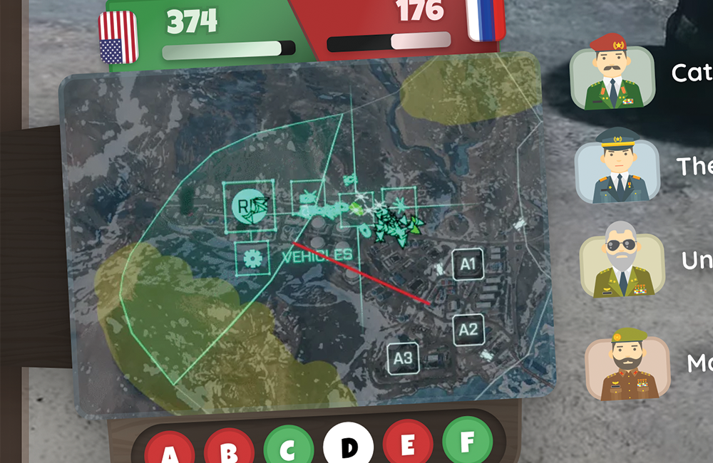
A transformed HUD with all the same info
I felt it was important to make this as realistic as possible, but placing a particular focus on bringing the same interface decisions from the title screen into play here. Albeit unconventional, I chose to implement a two-sided frame to add extra dimension with my panels bleeding off the edge of the viewport. And while not every possible status and scenario was mocked into this example, the structure supports expansion and evolution as numbers, names, and options ebb and flow during gameplay.


See it live on Figma