Modernize and standardize: two things I love to do.
In tandem with a project to reconstruct a popular net sellers calculator for a national title company, I was graciously awarded the proposal to design their new website for their corporate presence. It was an opportunity to invest further in defining key components and styles that matched not only their new branding and calculator application, but now also their entire online presence. This also trickled down into 9 sub-brand sites, where the design I crafted would be utilized for each (via WordPress child themes), minus specific content and imagery.
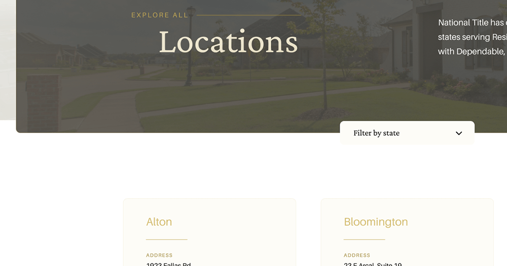
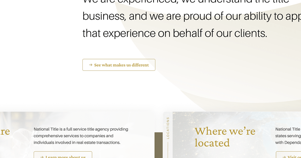
Note: de-branded until build of final design is complete and launched – the company is not called National Title!
I walk through my process steps below, and present the final screens for the primary website at the end.
View Full Concept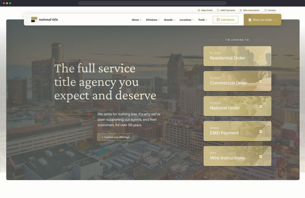
Project Intention
Modernize and standardize
Like I say above, this was the most important part of this project. Bring things up to modern web standards, align visual aesthetic with other new brand efforts, and enhance/evolve function as much as possible within scope.
Skills & Tools
- Design
- UX/UI
- WordPress
- Figma
- Photoshop
Update what exists
With content predominantly staying the same, outside of newly-crafted content areas, I focused on enhancing and beautifying much of what was already there.
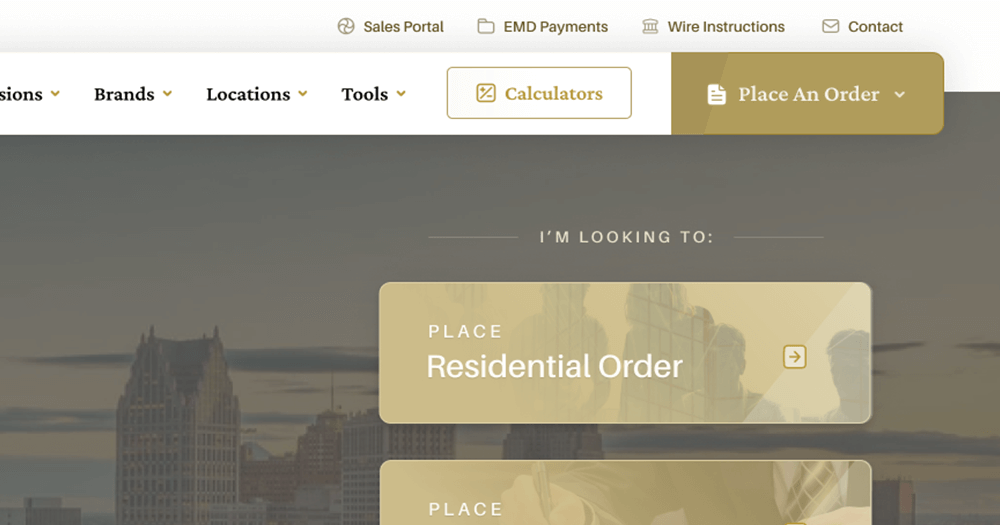
Align with the brand vision
There was an updated approach to the way the brand handled digital pieces, so I adhered to these expectations and ensured that typography, colors, containers, icons, gradient usage, and image effects were consistently handled.
Flex for standardization
Since the intention was for this design and structure to be applicable to all 9 of the primary company’s sub-brands websites, it was critical to build with flexibility in mind, without oversimplifying and losing the impact of the updated branding.
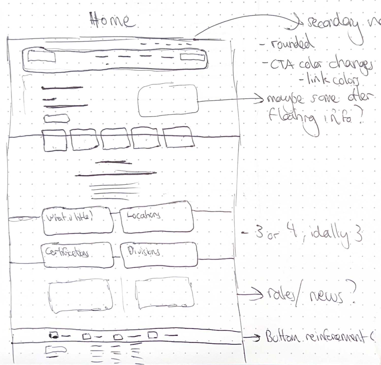
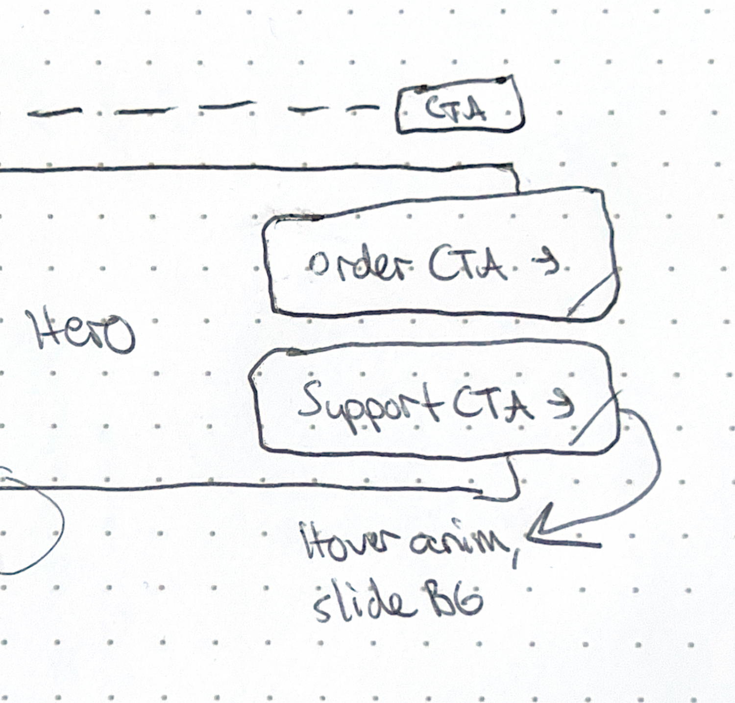
Starting with sketches
My efforts always begin with sketching, in some capacity. Writing ideas, goals, challenges, and key points, alongside of sketching potential layouts, is critical to my process for hashing through the most optimal options.

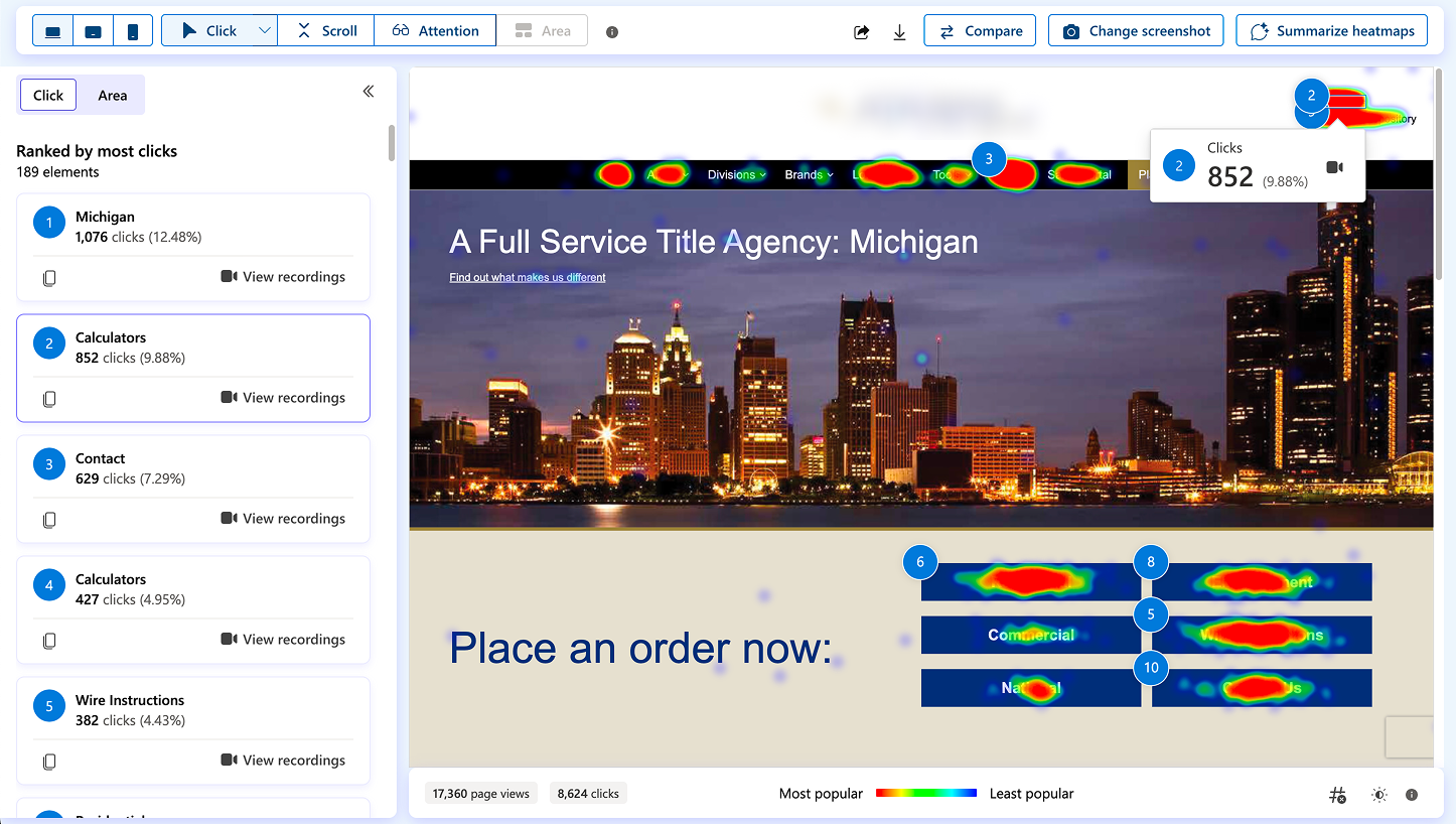
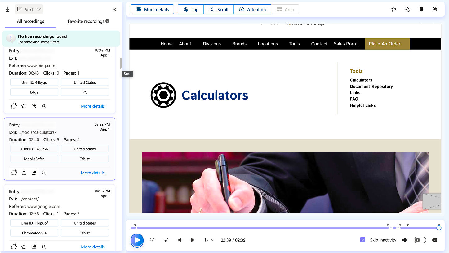
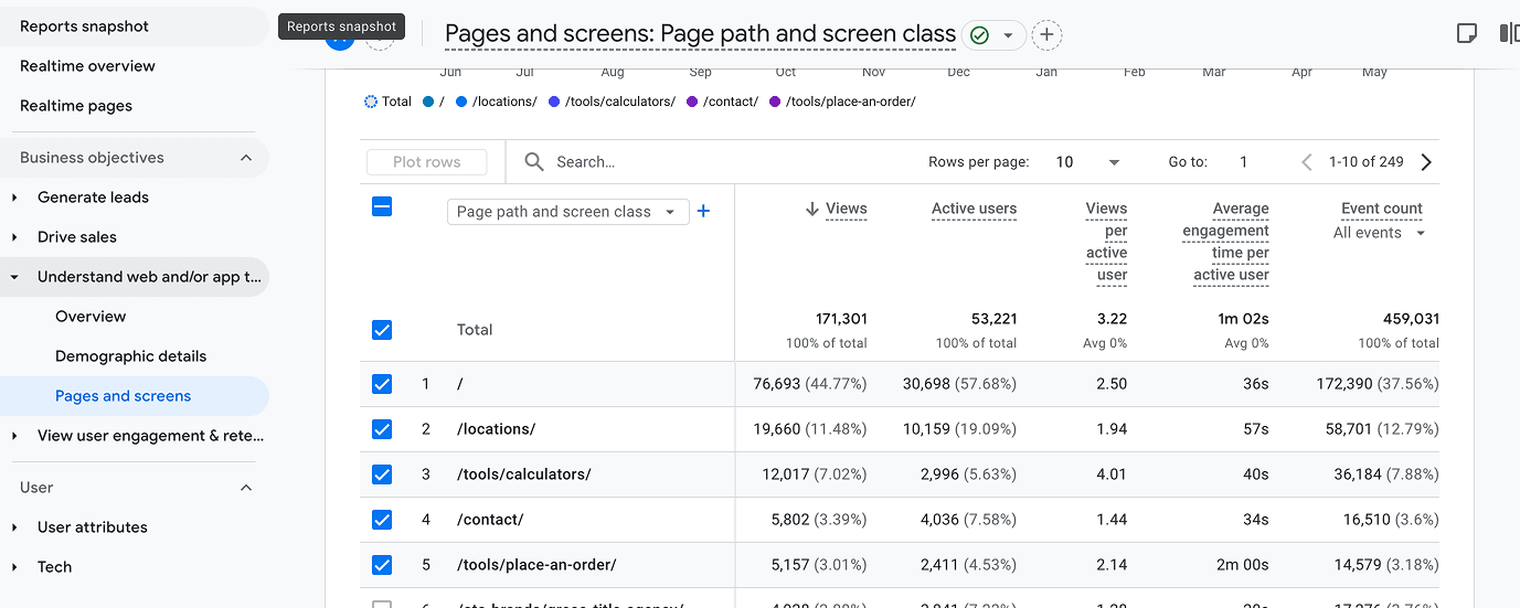
Gather user data
While I had been maintaining and working alongside this client for some time and therefore understood much of the user action and dissatisfaction points, I didn't want to assume anything. I implemented anonymous screen recording software for behavior analytics purposes, which allowed for me to evaluate each screen's successes and failures, as well monitor a variety of different user's interactions as they perused the site. This gave me much more fuel for my future decisions.
Challenges Solved
With the previously acquired user feedback and the collection of behavior analytics I did, as well as direction from corporate leadership
Inconsistencies with brand adherence
Not only was the existing usage of the old brand elements inconsistent, but nothing adhered to the updated brand definitions set at the corporate level. Therefore, I:
- Started from scratch, and redefined variables, components, and style definitions to replicate what was being used for updated brand guidelines.
- Utilized these in every facet of the layout and structure that I sketched and inevitably mocked up, ensuring to pull in consistent typography, container styles, use of gradient, image treatment, button styles, and call-to-action approaches.

Lack of modern presentation with UX flaws
From the user feedback that was acquired, a common thread was related to the less-than-modern approach to the existing website, and therefore, coming across as "dated". Thus, I:
- Approached this design with a completed fresh approach, hooking off of general brand guidelines that corporate was using at a high-level, and evolving them into specific styles, treatments, and design decisions.
- Opened up layouts, created more negative space, and ultimately crafted a more visually-impactful aesthetic without detracting from content readability.
- Ensured that comfort was kept at the forefront by retaining general information architecture and content structure, while making general navigation and usability enhancements.
Seeing the finished piece
The result was a polished, brand-adhering upgrade in a multitude of ways. I crafted approach with a comfortable structure, but not so comfortable that it feels like "any other site". This met the needs of the client impeccably, as their audience base was diverse in their technological comfort level, and many were used to the existing website. Pain points were ironed out, content hierarchy and readability were improved via clearer grouping and improved text sizing, and general aesthetic was amplified to represent that of a professional, high-end national brand.


Reflections & Next Steps
What would my next steps be if I continued design?
- Continue crafting each unique view to support development in replicating the exact intention behind the design.
- Construct a reusable component library so not only could development understand and reference as they deemed fit, but design could replicate and build out further sites, pages, and other digital elements (coinciding with overall brand library) - this may include merging with a corporate-level DAM.
- Build template specifically for replication that allows for another member of the design or development team to effectively "generate" a version for new sub-brands as they are acquired, so that reference mockups could be made for both internal stakeholders to approve, as well as development to follow. This would coincide with any WordPress child theme modifications required for doing the same from the development level, ultimately landing on a "sub-brand website generation" process to be developed.
What would I have done differently, given further scope/budget?
- Much more user research up front. While the quant was an excellent boon to decision-making data, more qual could have been done to ensure that very specific paint points or usability boons were included in this redesign.
- More prototyping for the sake of client presentation and stakeholder buy-in, as well as development handoff. This would involve creating transitions between views to show potential user paths, showcasing hover/call-to-action animations for clarity, and digging deeper into responsive menu work.
See it live on Figma